- Posts: 1119
- Thank you received: 377
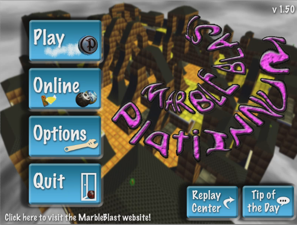
 MBP 1.50 Main Menu Sneak Peak
- Aayrl
-
- Topic Author
- Offline
- Administrator
-

- Big Deal!
Please Log in or Create an account to join the conversation.
- Jeff
-
- Offline
- Elite Marbler
-

- PlatinumQuest Programmer
- Posts: 1680
- Thank you received: 204

srsly though, buttons are amazing. Logo: OH MY GOD THAT IS THE UGLIEST PIECE OF S**T KNOWN TO MANKIND OH MY GOD MY EYES ARE ABOUT TO BLOW UP
I am a programmer. Most here know me for being one of the major contributors to Marble Blast Platinum and PlatinumQuest.
Please Log in or Create an account to join the conversation.
- IsraeliRD
-

- Offline
- Project Manager
-

- Dragon Power Supreme
"matan, now i get what you meant a few years back when you said that "the level in mbg is beyond me" after the last rampage i noticed things were insane, and now i truly feel that too" - Dushine, 2015.
Please Log in or Create an account to join the conversation.
- HiGuy
-

- Offline
- Lead Developer
-

- PQ Developer Emeritus
This signature is real code
Please Log in or Create an account to join the conversation.
- Jeff
-
- Offline
- Elite Marbler
-

- PlatinumQuest Programmer
- Posts: 1680
- Thank you received: 204

#legit #rekt #pqwhere #mbppls #rc1 #gimmienow
I am a programmer. Most here know me for being one of the major contributors to Marble Blast Platinum and PlatinumQuest.
Please Log in or Create an account to join the conversation.
- IsraeliRD
-

- Offline
- Project Manager
-

- Dragon Power Supreme
plottwist: winner has all ppl voting for it always getting it, the rest are gonna have the other one
"matan, now i get what you meant a few years back when you said that "the level in mbg is beyond me" after the last rampage i noticed things were insane, and now i truly feel that too" - Dushine, 2015.
Please Log in or Create an account to join the conversation.
- HiGuy
-

- Offline
- Lead Developer
-

- PQ Developer Emeritus
This signature is real code
Please Log in or Create an account to join the conversation.
- Jeff
-
- Offline
- Elite Marbler
-

- PlatinumQuest Programmer
- Posts: 1680
- Thank you received: 204

I am a programmer. Most here know me for being one of the major contributors to Marble Blast Platinum and PlatinumQuest.
Please Log in or Create an account to join the conversation.
- bigstewlegend
-
- Offline
- Professional Marbler
-

- i once rolled marbles, now just lurking around
- Posts: 373
- Thank you received: 51

Please Log in or Create an account to join the conversation.
- Frostfire
-

- Offline
- Senior Marbler
-

- Multiplayer Mastery
- Posts: 915
- Thank you received: 446
Please Log in or Create an account to join the conversation.
- ProMarbler
-

- Offline
- Senior Marbler
-

- Posts: 787
- Thank you received: 123
Please Log in or Create an account to join the conversation.
- Imperial
-

- Offline
- Expert Marbler
-

- Custom Levels Lover
Btw, where does the leaderboards button go?
Vanquisher / Red Stealer
My youtube channel: www.youtube.com/imperialcuirassier
My twitch channel: www.twitch.tv/imperialcuirassier
Please Log in or Create an account to join the conversation.
- Battlecube314
-
- Offline
- Professional Marbler
-

- 100% Gold/Ultimate/Awesome!!
- Posts: 446
- Thank you received: 155
Please Log in or Create an account to join the conversation.
- Jeff
-
- Offline
- Elite Marbler
-

- PlatinumQuest Programmer
- Posts: 1680
- Thank you received: 204

Imperial wrote: Btw, where does the leaderboards button go?
The online button

HiGuy's design has the PQ logo on it, so of course it is better

I am a programmer. Most here know me for being one of the major contributors to Marble Blast Platinum and PlatinumQuest.
Please Log in or Create an account to join the conversation.
- HiGuy
-

- Offline
- Lead Developer
-

- PQ Developer Emeritus
Frostfire wrote: I prefer higuy's, the marble logo thingy is better than that funky 'marble blast platinum' swirl imo. Rest of the design is fantastic though
If by "marble logo thingy" you mean the PQ logo, then sure.
This signature is real code
Please Log in or Create an account to join the conversation.
- Lee
-
- Offline
- Expert Marbler
-

- huehuehue
- Posts: 643
- Thank you received: 198
EDIT:Ok, here's the real reason why: what jeff said
Please Log in or Create an account to join the conversation.
- RandomityGuy
-
- Offline
- Administrator
-

- This entire place is bruh
Github:
github.com/RandomityGuy
Feel free to support me at ko-fi.com/randomityguy
Please Log in or Create an account to join the conversation.
- marblejc
-

- Offline
- Beginner Marbler
-

- Posts: 37
- Thank you received: 4
Please Log in or Create an account to join the conversation.
- ProMarbler
-

- Offline
- Senior Marbler
-

- Posts: 787
- Thank you received: 123
Please Log in or Create an account to join the conversation.
- elnathan
-
- Offline
- Advanced Marbler
-

- Posts: 210
- Thank you received: 16
The new one never appealed to me.
i have a flickr
Please Log in or Create an account to join the conversation.
- Perishingflames
-
- Offline
- Senior Marbler
-

- Posts: 882
- Thank you received: 21

Please Log in or Create an account to join the conversation.
- Buzzmusic
-

- Offline
- Developer Emeritus
-

- I make levels and songs.
- Posts: 678
- Thank you received: 144
In fact, in my opinion, the picture behind the logos and buttons should change. It's a bit too symmetrical and cubic for my tastes. Perhaps a description of the game in a vintage Papyrus font would do the trick. Just thinking out loud here.
All posts from my account that were made before July 29 2013 are from the point of view of my dad unless it states otherwise.
Please Log in or Create an account to join the conversation.
- Jeff
-
- Offline
- Elite Marbler
-

- PlatinumQuest Programmer
- Posts: 1680
- Thank you received: 204


In all honesty, the new GUI does look much much better in RC1. I started to get really tired of the legacy GUI. Good job co workers
I am a programmer. Most here know me for being one of the major contributors to Marble Blast Platinum and PlatinumQuest.
Please Log in or Create an account to join the conversation.
- whirligig
-
- Offline
- Professional Marbler
-

Buzzmusic wrote: I'd combine both menus and use "suck it plebs" as well as the twirly "MARBLE BLAST PlatiINNUM" logo.
FTFY
Please Log in or Create an account to join the conversation.
- ProMarbler
-

- Offline
- Senior Marbler
-

- Posts: 787
- Thank you received: 123
Higuy's, due to the amount of mockery involved. Sure to keep one on the edge for a long time.
Please Log in or Create an account to join the conversation.
- whirligig
-

- Offline
- Professional Marbler
-

Please Log in or Create an account to join the conversation.
- tporter
-

- Offline
- Beginner Marbler
-

- Posts: 43
- Thank you received: 18
And he waddled away, waddle waddle..
Please Log in or Create an account to join the conversation.
- ChaosUnown
-

- Offline
- Experienced Marbler
-

- MB Graphic/Interior Designer
Please Log in or Create an account to join the conversation.
- Eguy
-

- Offline
- Expert Marbler
-

- Booper Supreme
- Posts: 619
- Thank you received: 211
"it's the internet eguy. where children are men. men are monkeys, and women are PQ."
-Jeff 2014
Please Log in or Create an account to join the conversation.

