file So I built an XL kitchen level for the Intermediate section.

  • Jiquor
  • Jiquor's Avatar Topic Author
  • Offline
  • Professional Marbler
  • Professional Marbler
  • STOPX Creator
  • Posts: 366
  • Thank you received: 163
26 Apr 2017 19:28 - 26 Apr 2017 19:28 #1
I honestly think, in my opinion, this is one of my better XL room/object designs.
It's going to have a lot in it - this is just the kitchen and some trees for now.

> inb4 someone posts criticism thats negative and talks trash about my level and/or mod

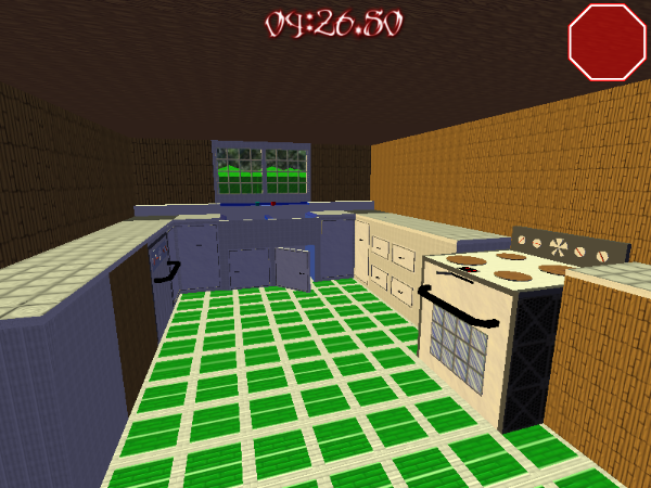
There's some photos here for you to see.

Note:
The kitchen is still unfinished. I still need to put all the objects, power-ups, and teapots in here.
Otherwise, the interior itself looks simply amazing.


STOPX Creator. Getting better by every release.
Attachments:
Last edit: 26 Apr 2017 19:28 by Jiquor. Reason: minor text fixes
The following user(s) said Thank You: Nockess, Weather

Please Log in or Create an account to join the conversation.

  • Posts: 643
  • Thank you received: 198
27 Apr 2017 11:36 #2
Looks great!

Though the oven looks too square. Add more depth to the glass (put it back a bit) and the grey sides (make it stand out). It will look much better.

The handles are too big in my opinion. Make it shorter.

That's all for me about the pictures. I don't think there are any more stuff that needs to be improved.

lee is awesome
The following user(s) said Thank You: Jiquor

Please Log in or Create an account to join the conversation.

  • Jiquor
  • Jiquor's Avatar Topic Author
  • Offline
  • Professional Marbler
  • Professional Marbler
  • STOPX Creator
  • Posts: 366
  • Thank you received: 163
27 Apr 2017 15:17 #3

Lee wrote: Looks great!

Though the oven looks too square. Add more depth to the glass (put it back a bit) and the grey sides (make it stand out). It will look much better.

The handles are too big in my opinion. Make it shorter.


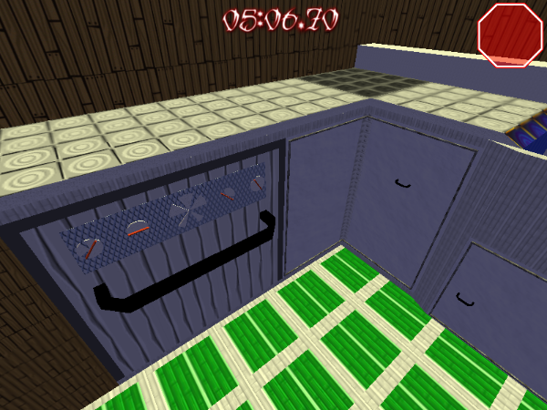
More depth to the glass? Heck, I have a better idea: how about I make the glass transparent where you can also see the INSIDE of the oven? :)

The grey sides? I'm going to change them to edge whites. It will look nicer.

I measured the handles on my kitchen oven and compared them to the handles in constructor. You're right! They could be much smaller. That has been done. I'll upload a full kitchen picture probably tonight.

STOPX Creator. Getting better by every release.
Please Log in or Create an account to join the conversation.

  • eblu
  • eblu's Avatar
  • Offline
  • Intermediate Marbler
  • Intermediate Marbler
  • (formerly eboyblue3)
  • Posts: 78
  • Thank you received: 54
28 Apr 2017 18:43 - 28 Apr 2017 18:44 #4
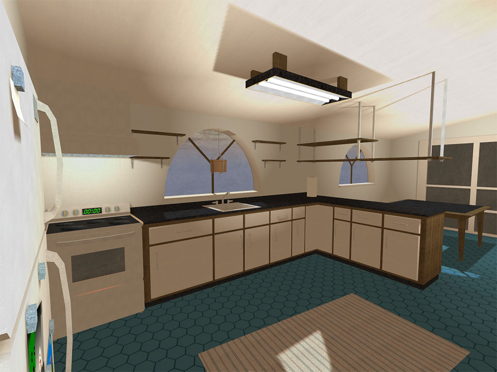
someone already made a kitchen in torque :P


in all seriousness the texturing could use some work. looks a bit too busy for a kitchen

IsraeliRD wrote: The...

come discord brah: eblu#8048
Last edit: 28 Apr 2017 18:44 by eblu.

Please Log in or Create an account to join the conversation.

  • Jiquor
  • Jiquor's Avatar Topic Author
  • Offline
  • Professional Marbler
  • Professional Marbler
  • STOPX Creator
  • Posts: 366
  • Thank you received: 163
28 Apr 2017 19:08 - 28 Apr 2017 19:13 #5
So you're basically saying my kitchen is bad.
And of all people, it has to come out of your mouth?

I personally think in a marble blast sense, there's nothing wrong with the texturing except (in the older photos, the oven needing some work, which I've fixed up.) I know this is just your opinion and you don't have to like it, but I'd appreciate it if you invade someone else's thread with your snarky, edgy, and rude commentary.

I saw the photo of the other kitchen before you removed it. I don't know who made it or what game it was for, but I find the need to remove this level because of something like this.

Why can't I just make a mod without someone flaming and attacking me?

STOPX Creator. Getting better by every release.
Last edit: 28 Apr 2017 19:13 by Jiquor.

Please Log in or Create an account to join the conversation.

  • eblu
  • eblu's Avatar
  • Offline
  • Intermediate Marbler
  • Intermediate Marbler
  • (formerly eboyblue3)
  • Posts: 78
  • Thank you received: 54
28 Apr 2017 19:16 #6
ok ok lemme clear things up

the first half of the post was a joke. i put an emote in there and an "in all seriousness" after it so it's pretty obvious

as for the latter half i was just trying to say "hey, this part looks a lil off, you should think about fixing it." i was NOT intending to antagonize what you made.

sorry if i screwed up anything in communication. like you i have asperger's and afaik that complicates social skills. keep going man.

IsraeliRD wrote: The...

come discord brah: eblu#8048

Please Log in or Create an account to join the conversation.

  • Jiquor
  • Jiquor's Avatar Topic Author
  • Offline
  • Professional Marbler
  • Professional Marbler
  • STOPX Creator
  • Posts: 366
  • Thank you received: 163
28 Apr 2017 19:19 #7
what parts look off to you?

also remember: nobody can get a joke unless they are saying it is one on a message/forum board

by voice you can tell pretty well, whereas online you really can't :P
that's not just hard for me, but hard for a lot of people here

STOPX Creator. Getting better by every release.
Please Log in or Create an account to join the conversation.

  • Posts: 251
  • Thank you received: 91
28 Apr 2017 19:22 - 28 Apr 2017 19:28 #8
the picture in the first post actually looks good! keep making "building interior" style levels

Jiquor wrote: also remember: nobody can get a joke unless they are saying it is one on a message/forum board

wtf, its not hard; even if you couldnt tell by the tone of the post, the emote or the "in all seriousness" didnt tip you off that it was a joke??

edit:

Jiquor wrote: Why can't I just make a mod without someone flaming and attacking me?

the toxic attitude really isnt helping your case, no one is actively trying to stop you from making a mod but you have to understand that posting your work here means having to accept peoples feedback, both positive and negative -- it is part of the creative process and telling people to go away is not constructive
Last edit: 28 Apr 2017 19:28 by snowbody.
The following user(s) said Thank You: MBOUltimate, NF, Nockess

Please Log in or Create an account to join the conversation.

  • eblu
  • eblu's Avatar
  • Offline
  • Intermediate Marbler
  • Intermediate Marbler
  • (formerly eboyblue3)
  • Posts: 78
  • Thank you received: 54
28 Apr 2017 19:28 #9
i should have clarified that the floor tiles(?) and wooden walls looked busy instead of the entire thing and again i'm sorry. you've done an excellent job making the interior, and i'm pleasantly surprised by the work you've done on STOP II.

IsraeliRD wrote: The...

come discord brah: eblu#8048
The following user(s) said Thank You: Frostfire

Please Log in or Create an account to join the conversation.

  • Jiquor
  • Jiquor's Avatar Topic Author
  • Offline
  • Professional Marbler
  • Professional Marbler
  • STOPX Creator
  • Posts: 366
  • Thank you received: 163
28 Apr 2017 19:31 #10
I think the floor tiles should stay as they are. It's what they look like in my kitchen - which is why I made them.

What should I change the wooden walls to? Edge whites? Solid whites?
What's your idea?

STOPX Creator. Getting better by every release.
Please Log in or Create an account to join the conversation.

  • eblu
  • eblu's Avatar
  • Offline
  • Intermediate Marbler
  • Intermediate Marbler
  • (formerly eboyblue3)
  • Posts: 78
  • Thank you received: 54
28 Apr 2017 19:33 #11
possibly something simpler. remember that most kitchens have drywall and not wooden walls.

i'd imagine a solid, desaturated color with some detail here and there, but it's your mod. you do what you want.

IsraeliRD wrote: The...

come discord brah: eblu#8048

Please Log in or Create an account to join the conversation.

  • Jiquor
  • Jiquor's Avatar Topic Author
  • Offline
  • Professional Marbler
  • Professional Marbler
  • STOPX Creator
  • Posts: 366
  • Thank you received: 163
28 Apr 2017 19:47 #12
How about a solid white with some noise, like the drawers?

STOPX Creator. Getting better by every release.

Please Log in or Create an account to join the conversation.

Moderators: Doomblah
Time to create page: 1.608 seconds
We use cookies

We use cookies on our website. Some of them are essential for the operation of the site, while others help us to improve this site and the user experience (tracking cookies). You can decide for yourself whether you want to allow cookies or not. Please note that if you reject them, you may not be able to use all the functionalities of the site.